How might we lower the threshold of employment success for international students residing in the U.S?
DESCRIPTION
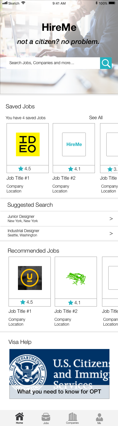
An employment-seeking platform catered to international students seeking jobs in the U.S. It filters out companies who do not provide visa-sponsorship and provides the necessary resources and information for students regarding the steps they have to take for visa-related situations.
Approach
This design was inspired from a series of surveys and interviews I conducted where I collected concerns and frustrations from existing employment-seeking platform users.
International students studying in the United States are frustrated with the extra steps they need to take when seeking employment in the U.S and wish there was more transparency from potential employers concerning with visa-sponsorship.
PERSONA

PROCESS
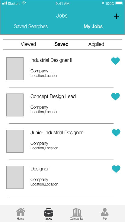
Began with a user flow diagram to help me visualize the larger picture of a user’s journey with this app. Like other employment seeking sites it must some key components: company information, job opportunity information, searching tool, profile
A a key unique feature that separates this app is the fact that it is catered towards international students.
So how might this app differentiate itself from others?

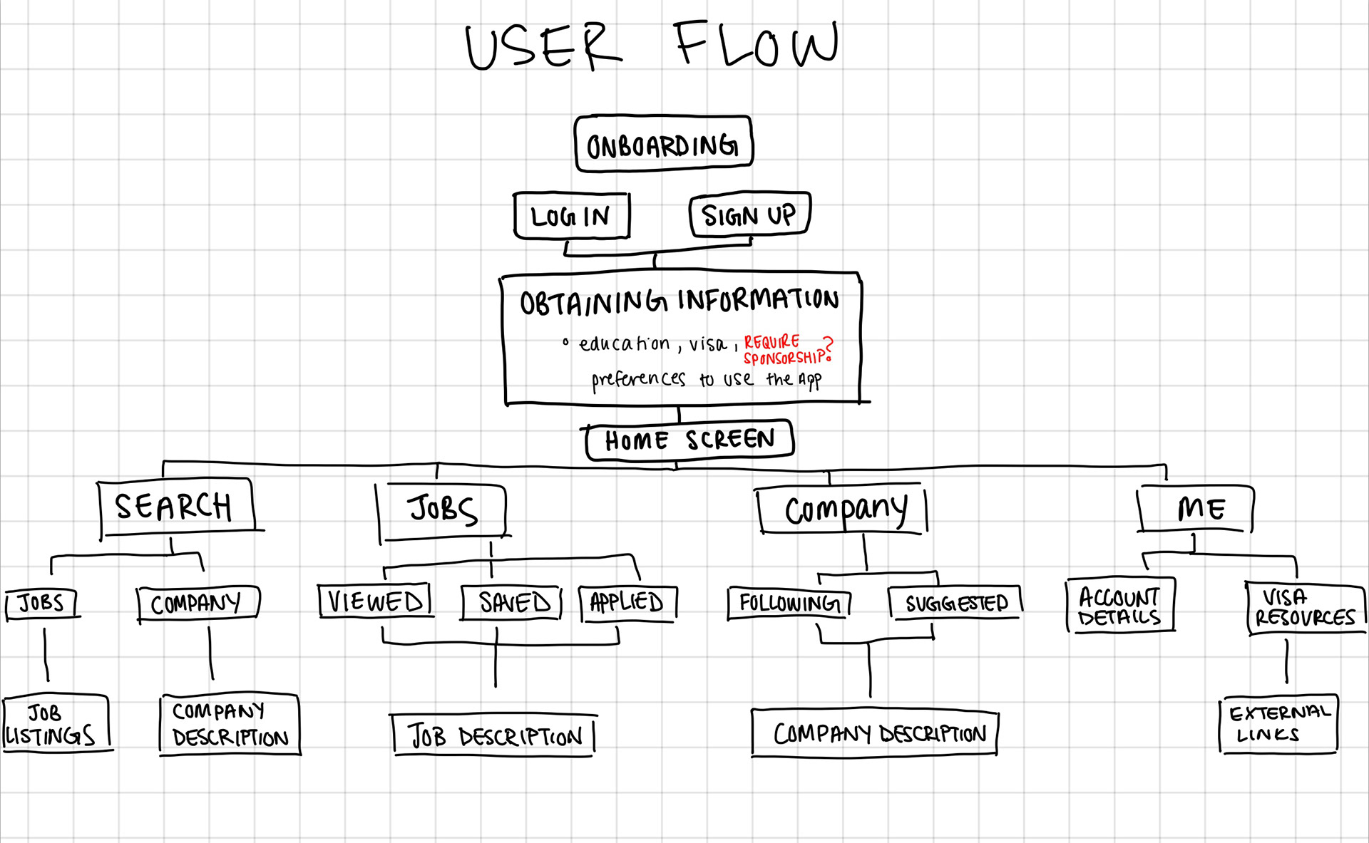
As part of the international student society in University of Michigan, I often hear from my international student peers their frustrations towards post-graduation process. The current solution is to visit the International Center, however that is a headache on its own as students are sent on a wild goose chase to figure out and accomplish the steps needed.
To reduce this headache for our targeted users, I decided to include a visa information resource, where students can have access to all the necessary information they need in one platform.


Preliminary Screen Design
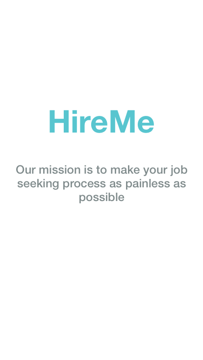
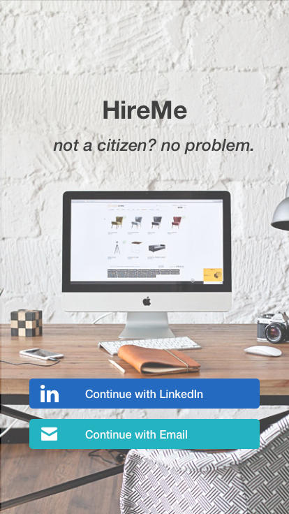
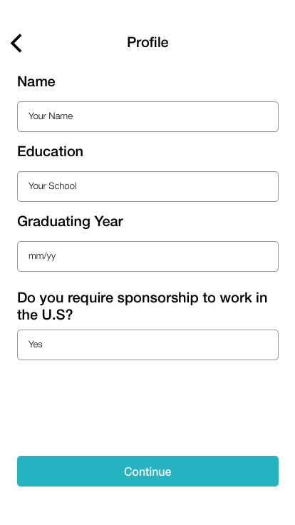
Users suggested to make it clear it is for international students in the on boarding stage on this app. From feedback, it was suggested to include a mission statement and make a clear question on whether the user needs sponsorship.
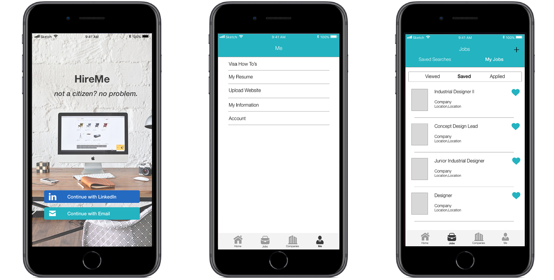
SCREEN DESIGN


DESIGN ELEMENTS:
The user flow of this app was based on other existing employment seeking services such as Indeed, LinkedIn, and Glassdoor. I decided to follow these flows because current users have been using these apps and I did not want to disrupt what they are already used to and have them readjust their habits. The existing apps have a simple colour pallet, which was one unique colour complimented with a white background and other grey variants. The simplicity of colour choices kept the experience of the app professional which ties in with the main function of the app - employment seeking.
FINAL INTERACTIVE PROTOTYPE
POSSIBLE NEXT STEPS
Make a concept exploration of current employment-seeking apps (such as LinkedIn, Glassdoor, Indeed) that would integrate the features and resources I've included in this app.